

Table of contents
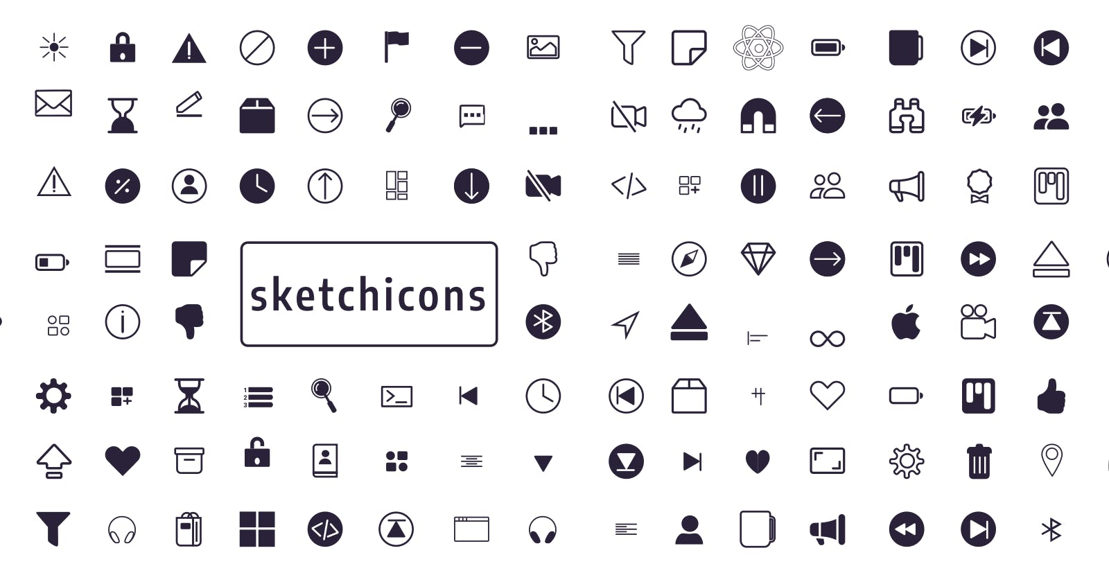
Sketch icons is a completely open-source icon set with 600+ icons that makes it easy for individuals to utilise icons. The Sketch-icons Web Component is a simple and effective way to incorporate Sketch icons into your app. The component will dynamically load an SVG for each icon, ensuring that your app only requests the icons it requires.
Website : sketch-icons.netlify.app
Installation
npm i sketch-icons
# or
yarn add sketch-icons
Usage
import { PlayFill } from "sketch-icons";

class Icons extends React.Component {
  render() {
    return (
      <h2>
        Here's a <PlayFill />
      </h2>
    );
  }
}
Using CDN
If you want to use the icons in your project, you can use the CDN. Add the following cdn to your HTML file.
<link
  rel="stylesheet"
  type="text/css"
  href="https://unpkg.com/sketch-icons@0.1.13/dist/cdn/icons.css"
/>
Example
To utilize the pre-built icon from the sketch icons bundle, populate the class property on the i tag
<head>
  ...
  <link
    rel="stylesheet"
    type="text/css"
    href="https://unpkg.com/sketch-icons@0.1.13/dist/cdn/icons.css"
  />
  ...
</head>
<body>
  ...
  <i class="sk sk-alarm-fill"></i>
  ...
</body>
Using CSS Selector
You can change the properties of icon using the css selector. The selector is .sk- followed by the icon name.
.sk-alarm-fill {
  color: red;
  font-size: 35px;
}
Properties
| Property | Attribute | Default |
| color | color="color" | #2A2238 |
| height | height={height} | 32 |
| width | width={width} | 32 |
| stroke | stroke="stroke-color" | #2A2238 |
| strokeWidth | strokeWidth="stroke-width" | 1.5 |
import { ArrowUpCircle, ArrowDown } from "sketch-icons";

class Icons extends React.Component {
  render() {
    return (
      <h2>
        Go Up <ArrowUpCircle height={100} width={100} />
        Move Down <ArrowDown stroke="blue" strokeWidth="0.1" color="#ffffff" />
      </h2>
    );
  }
}
Icons
Click here to see all sketch-icons